Bevan Briefing #10 There were 170,000 in the bed and the little one said 'I'm not sure that's a robust metric....’
A long time ago in a time before widespread machine learning tools and the ability to grab just about any academic paper from the internet without an ATHENS log in, I was sat at my desk trying to get to grips with the data on Mid Staffs as part of the initial investigation into mortality rates. Part of that work has never really sat right with me as a massive assumption was made and I wasn’t able to challenge it effectively at the time as I didn’t have the skill or the time to do it, but it’s gnawed at me ever since.
That is the myth which is the 85% occupancy target. Or 90%. Or if you’re in a pinch, 92%. But never over it.
Where the hell did this concrete, lovely round number which everyone was convinced was right come from?
In this issue of the newsletter I've given it a crack. It's taken a long time as the baby and I have been ill. We've both had this virus which is going round, she fared better than I did by getting over the worst of it in a couple of days whereas it hung around for me for about 2 weeks. Illness when you're still nursing a baby and doing all the night wakings are not for the weak.
Part of keeping me sane through it all was listening to this podcast from the BBC which is a disquieting listen. It includes an interview with Aseem Malhotra and a few other people who are in the market of disinformation (athough they wouldn't identify in that way). Its a bit dystopian so I wouldn't recommend listening at 3am with a wailing baby like I did.
Later on I'll cover my views on
- The data privacy debalce surrounding UK Biobank
- FDP and Palantir contract in the media
- Closing the door on open source in NHSE
- Whats next for me (oooh drama and intruigue!)
But for now, pull up a pew, get yourself a drink and settle in while I tell you the story of Goldilocks and the single bed base occupancy target for all of England.
Back to the occupancy target - this number is used in many ways outside of the operational management day-to-day. It’s used as part of benchmarking when suggesting what bed base changes a trust could implement if they were able to target Average Length of Stay for each HRG code. (as an aside – a pal calculated in 2012 that if a trust was mean average for all HRGs they would be the best performing Trust by a country mile. Shows that targeting mean isn’t all it’s cracked up to be). It's used in this way in things like Model Hospital and Model Health System to calculate what bed base reductions could look like and used to underpin CIP programmes.
I’d pieced together a few bits on the academic origins of this zombie stat and shoved it in my blue filing cabinet of health policy (deliberately NHS blue, might I add) but not got round to the critical part – what the hell should it be? I’ve long said the axiom that ‘the price of objection is a better solution’ but drawn a blank on this one for a long while.
One of the few joys of having a baby who doesn’t sleep is it’s given a bit of time for me to master data cleaning and wrangling one handed and learning new tools.
A note here on what tool I’ve used to do what
I’ve used Python to do the coding and have run my codes through Claude and Gemini to do a 2 review check (tiredness and being on my own means I know I’m prone to making errors)
I’ve used Claude Design to zhush up the outputs into graphs and images which illustrate the points I’m making in the blog
I’ve published the code to github https://github.com/LB1983/nhs-bed-occupancy-analysis
Finally, I’ve used Claude and Gemini to check my referencing.
Feel free to point out any mistakes, I am in no way infallible and working on my own does leave me prone to methodological tunnel vision. Baby Annie is not yet up to the standard of being Reviewer 2.
This porridge is (running) too hot
Every autumn, NHS England issues its winter planning guidance. Every autumn, trust chief executives study it carefully, note that bed occupancy should not exceed some percentage — 85%, then 90%, then 92%, depending on which year they are reading — and set about trying to comply. Every winter, most trusts exceed it. Every winter, the NHS declares a crisis. ‘Twas ever thus.
This has persisted for the better part of three decades. It has survived reorganisations, pandemics, a change of government, and the occasional change in number without a statistical reason why. It’s also annoyed me for almost 20 years. It’s time I got my own back.
The 85% figure has a precise origin. In 1999, Bagust, Place, and Pocock published a simulation study in the BMJ modelling the relationship between bed occupancy and the probability that a patient requiring emergency admission could not be accommodated. Using a queuing theory model calibrated to a hypothetical static capacity 200-bed emergency ward, they found that the probability of a bed crisis approached zero at occupancy below 85%, rose to around 1% at 90%, and increased exponentially thereafter.
This was careful, mathematically rigorous work. It was also very specifically about a single modelled non elective ward of a specific size. Bagust and colleagues were explicit about the key limitation: the safe occupancy level is size-dependent. Their 85% finding applied to the particular 200-bed NEL configuration they modelled. This number was totally static and had no swing capacity, no winter ward, no decant and also - no elective patients. Just a steady bed base – because it wasn’t supposed to be used as a target.

This porridge is in a different bowl
If 85% were genuinely evidence-based, it would have stayed at 85%. It did not.
NICE reviewed the evidence in 2018 and concluded that a 'pragmatic maximum' of 90% was more appropriate — while acknowledging that the evidence was graded very low for all outcomes. The threshold moved up 5 percentage points without new empirical foundation.
The 2023/24 NHS operational planning guidance went further still, recommending that occupancy should not exceed 92%. In Q4 2024/25, the actual general and acute bed occupancy rate across NHS England was 92.5% — above even this revised ceiling.
Three thresholds in 25 years. None derived from new evidence. The system consistently exceeded all three. Something is wrong with the target, not the hospitals.
Plus, as we know, harm happens from lots of different places. Inability to put in place effective infection control due to overcrowding is one, but so is understaffing, too many bank staff, not enough senior cover, lack of critical tests OOO (like urgent CTs) – it’s not just how full the beds are but how unwell each of those patients are and whether the system has the right resources, skill and treatments to help. This includes care outside the hospital. Hard to do in a percentage though.
Recipe for porridge (yes I'm going to be pushing this tortured metaphor throughout)
The dataset I used covers approximately 5,400 quarterly observations for around 140 NHS acute trusts in England from 2018-19 to 2024-25, drawing on KH03 bed availability returns, the A&E SitRep, the UEC SitRep, and the quarterly cancelled operations return all sourced from the NHS England website with one hand whilst holding a baby and watching reruns of Poirot on ITVX.
I also used the Royal Mail postcode data and the NHS directory to get the postcodes for each site and then used ODS to get me latitude and longitude co-ordinates for each site. All are available on my github.
My definition of harm / problems (now I concede that this is a very vexed area and I was super limited by what I could find freely available online) was to look at cancelled operations, A&E waiting times and breaches and UEC. All of which can be impacted by bed base (amongst other things). I’d like to have rolled in C Diff / MRSA rates but I couldn’t get them at the same level of granularity to be able to link them.
The first analytical challenge is Simpson's paradox. In the raw data, higher-occupancy trusts look like better performers — because large teaching hospitals have both high occupancy and good performance for entirely separate reasons. Comparing them to smaller trusts is comparing unlike with unlike. (a Romanian friend told me that their version of ‘comparing apples and oranges’ is ‘comparing grandmas and machine guns’ which is much better and I shall be adopting that from now on).
I used two-way fixed-effects panel regression, controlling for all time-invariant trust characteristics and common time shocks. The Hausman test formally confirmed that the within-trust and between-trust relationships are statistically different — the naive cross-section gives the wrong answer. This is also where looking at before, during and after COVID was important.
Once the correct specification is applied, rising occupancy within a trust is associated with worse A&E performance, more 12-hour waits, more cancelled operations, and more delayed transfers. The relationship is real. But it is linear — harm rises steadily with occupancy, without any kink or step change at 85%. This is admittedly not new insight but it’s useful to have it confirmed.
The kicker is that it is also different based on where the trust is relative to its neighbours. Something I’d thought about and that pals in ops management have long said, it’s easier to keep within your means if you have a neighbour who can take in your excess capacity at a reasonable distance. Even better if they have tertiary capacity and capabilities and even better still if you can get the ambulance to divert there if you need to so you don't have to do a messy transfer between Trusts. A problem shared and all that. Unsurprisingly, having a system is helpful.
Invited over the threshold
Threshold models test a simple question: does crossing a specific percentage cause a sudden jump in harm? I estimated these models for every threshold from 80% to 92%, for every outcome. Yes this took me a while and I got quite good at it so I played around with doing it a lot.
Table 1: Threshold model p-values (trust + time FE, clustered SE, all-beds occupancy)
|
Threshold |
A&E 4hr
p-value |
12-hr waits
p-value |
Cancelled
ops p-value |
|
80% |
0.923 |
0.109 |
0.664 |
|
82% |
0.864 |
0.243 |
0.134 |
|
85% (NHS
target) |
0.520 |
0.241 |
0.793 |
|
88% |
0.362 |
0.633 |
0.468 |
|
90% |
0.364 |
0.557 |
0.235 |
|
92% |
0.589 |
0.178 |
0.296 |
Not a single threshold, at any level, reaches p < 0.10 for any of the three outcomes. The 85%/90%/92% target is not a statistically detectable feature of the relationship between occupancy and performance in NHS trust-level data. It is not there.
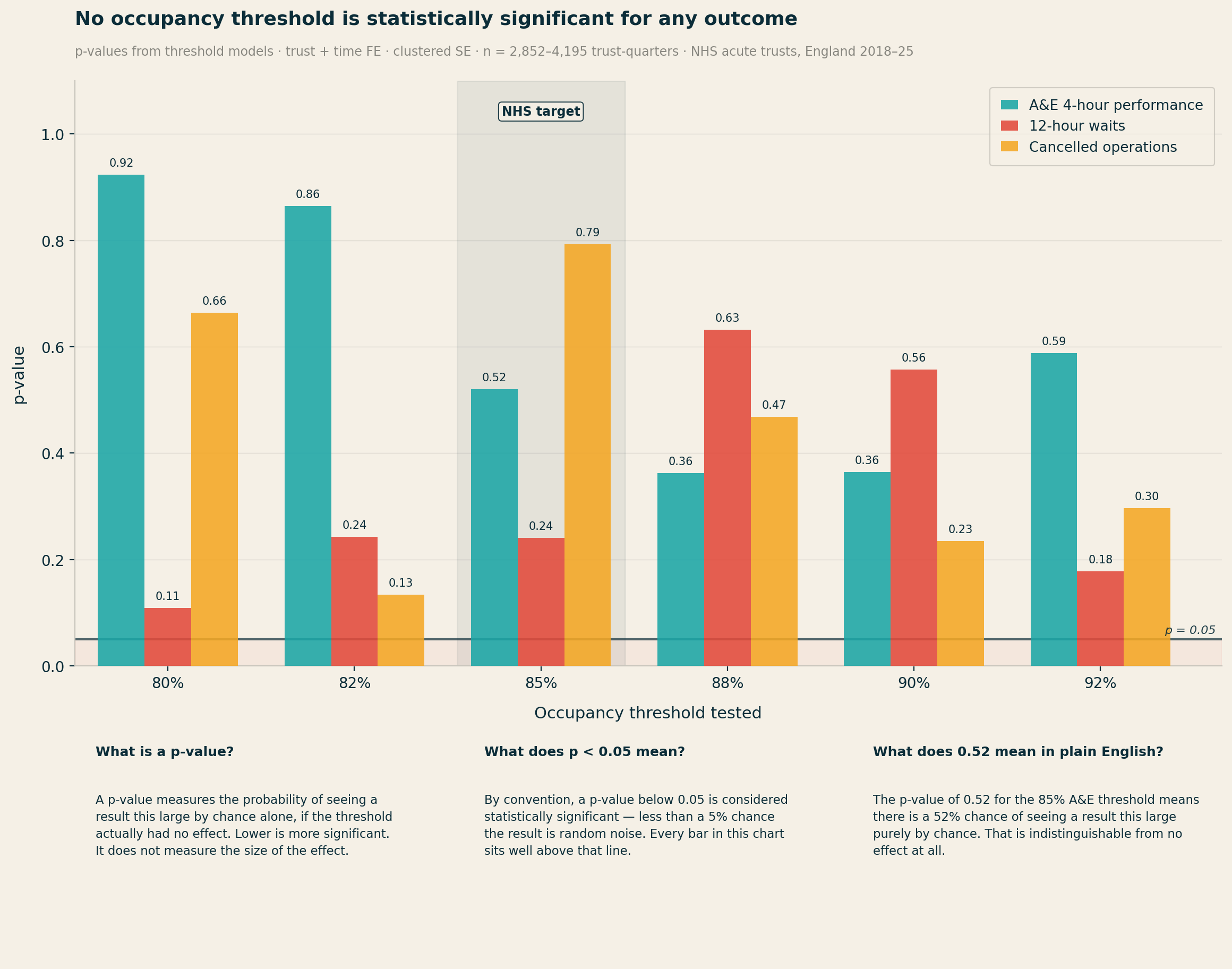
Piecewise linear spline models, which allow the slope to change freely at 80%, 85%, and 90%, confirm the finding. There is no statistically significant kink at 85%. These models are not underpowered — the A&E sample contains 3,551 trust-quarter observations.
In simple models, the main occupancy coefficient for 12-hour waits is negative. Higher occupancy appears to predict fewer 12-hour waits. This is not a data error — it is Simpson's paradox.
Large, well-resourced trusts tend to have both higher bed occupancy and better A&E performance than smaller DGHs. The correct approach — controlling for bed base, geography, and trust fixed effects — reveals the true positive relationship. The sign reversal in naive data tells you that any occupancy analysis that does not properly control for trust-level heterogeneity will mislead.
Who's been sleeping in my bed?
The strongest result in the analysis is for cancelled operations per 100 General and Acute1 beds. The model with occupancy interacted with bed base produces an R² of 39.6% — strong for a fixed-effects panel model. The interaction coefficient (occupancy × bed base) has p < 0.001.
The small-trust quadrants — particularly Small + Rural — show the most acute harm amplification per unit of occupancy rise. North Devon Healthcare, with 305 beds and no acute neighbour within 57km, carries a harm coefficient of +6.55: the highest in the entire dataset, and more than twice that of Royal Cornwall.
A given rise in occupancy causes substantially more harm at larger trusts in absolute terms — but the rate of harm is worse at smaller trusts. A small trust running at 88% has far less slack than a large trust at the same rate. The safe occupancy level is a function of scale. This is precisely what Bagust et al. found in 1999. The NHS's policy implementation extracted the headline number and discarded the insight.
Location location location
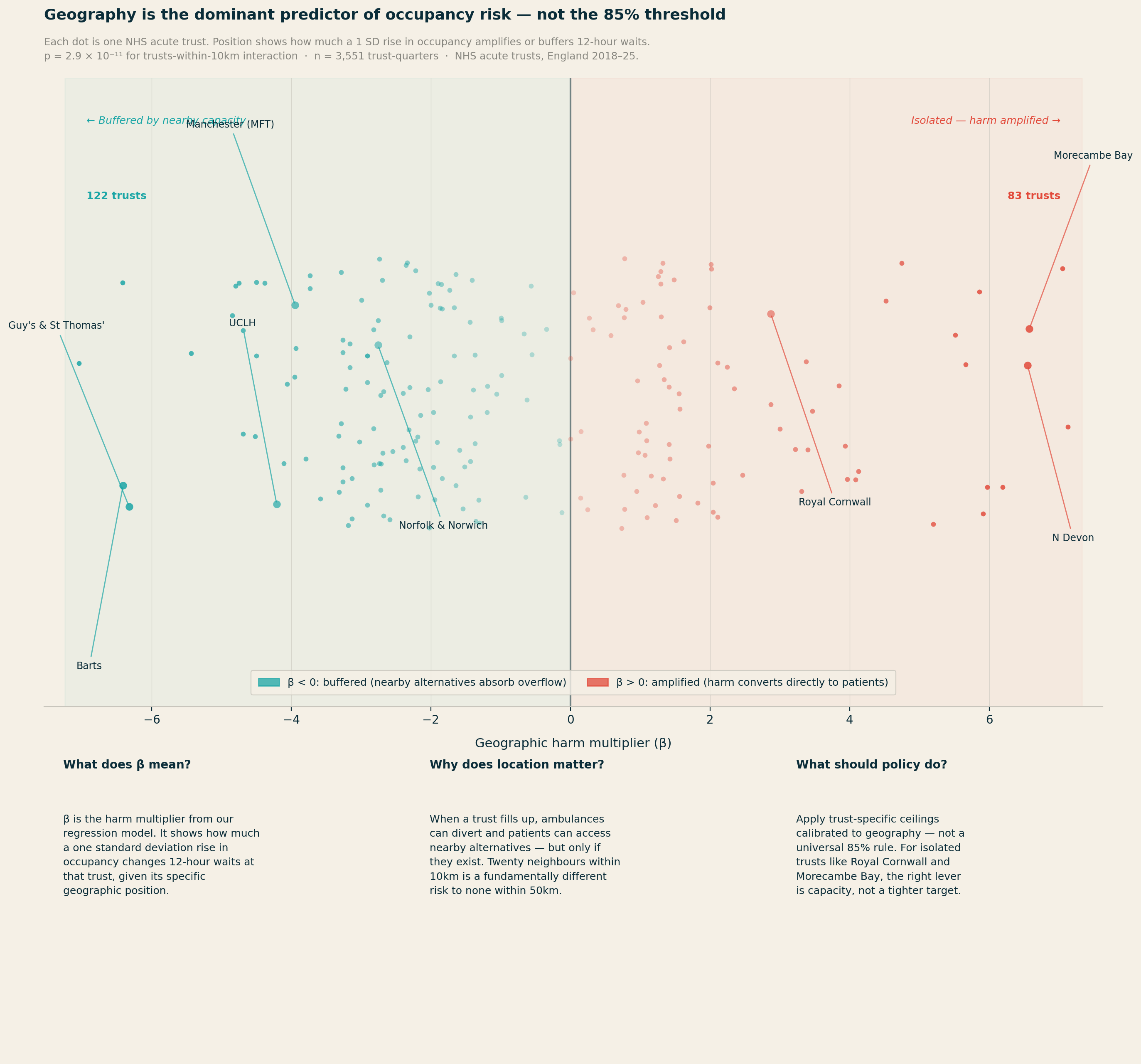
The most statistically significant finding in the entire analysis is not about occupancy at all. It concerns geography.
For 12-hour waits, the number of competitor trusts within 10km produces p = 2.9 × 10⁻¹¹. The main occupancy effect for the same outcome has p = 0.42. Geography is not a nuance. It is the dominant story.
Two distinct effects emerge, pulling in opposite directions. Trusts with many alternatives close by — within 10km — show a weaker relationship between occupancy and harm. When real diversion options exist, high occupancy at one site does not necessarily translate into patients stuck in corridors: ambulances can redirect, walk-ins can be redirected, and pressure distributes across the system. There are release valves in the system which give people options elsewhere.
The most isolated trusts — those with no acute neighbour within 25km or more — show the most direct conversion of high occupancy into patient harm, because they effectively are the system for their population.
The range of geographic circumstances across NHS trusts is stark. Central London trusts have up to 49 acute neighbours within 25km. Royal Cornwall and the Isle of Wight have none. Applying the same occupancy target to both settings is, on the evidence, incoherent.
What couldn't be established
I made a few attempts to go beyond association and establish whether high occupancy causes worse outcomes, using a technique called instrumental variables. The idea is to find something that drives occupancy up or down — but that affects patient outcomes only through its effect on occupancy, not directly. Based on the available data, I tried two candidates: the condition of a trust's estate (from the NHS ERIC dataset), on the theory that poorly maintained buildings reduce effective capacity and are harder to treat patients in; and regional flu severity (from UKHSA surveillance data), on the theory that a bad flu season in a trust's region drives emergency admissions and makes for a trickier winter. Neither proved strong enough. The statistical test for instrument strength — the first-stage F-statistic — returned values well below the accepted threshold of 10 for both which shows that there’s no strong causation there: the within-trust associations are robust and consistent, but I can’t rule out that some unobserved factor (or something not in the publicly available data set) is simultaneously driving both occupancy and outcomes. The estimates should be treated as well-identified associations rather than causal effects.
The analysis is also strongest for the post-2021 recovery period. In the cleaner pre-COVID data (2018-19 to 2019-20), the within-trust effects are present but weaker and less consistently significant. This may reflect the fact that the post-COVID NHS operates under more sustained system-wide pressure, making the occupancy-to-harm conversion more visible. It is a reason for some caution about treating the coefficients as fixed structural parameters — they may describe a system under particular stress, not a timeless relationship.
These limitations do not undermine the core argument. The evidence that harm is broadly linear (not kinked at 85%), that geographic isolation dramatically changes a trust's risk profile, and that some trusts are structurally beyond any clinically defensible ceiling under current capacity — these findings are stable and practically significant. They point clearly toward locally differentiated targets, even if the precise numbers should be treated as starting points for system-level conversations rather than hard engineering tolerances.
The interaction coefficients can be applied to individual trusts to compute their specific harm multiplier — the predicted change in 12-hour waits per 1,000 A&E attendances for a 1 SD rise in occupancy. I did this for six archetypes covering all four quadrants of a size-rurality matrix.
My brain works better with real Trusts / types of organisations in mind, especially when the subject is this abstrac.
Table 2: Six trust archetypes — size, rurality, geography, and implied local ceiling
|
Trust
(archetype) |
Quadrant |
Mean /
recovery occ |
Harm β |
Local ceiling |
vs 85% |
|
UCLH |
Large + Urban |
78.5% / 79.3% |
−3.82 |
88% |
+3pp |
|
Manchester
MFT |
Large + Urban |
87.0% / 90.7% |
−3.85 |
86% |
+1pp |
|
Norfolk
& Norwich |
Large + Urban* |
89.0% / 92.0% |
−2.77 |
83% |
−2pp |
|
Royal
Cornwall |
Large + Rural |
86.4% / 92.2% |
+2.67 |
76% |
−9pp |
|
Poole Hospital |
Small + Urban |
86.8% / 86.8% |
−3.02 |
87% |
+2pp |
|
North Devon |
Small + Rural |
77.0% / 77.0% |
+6.55 |
77%† |
−8pp |
* Norfolk & Norwich: classified Large + Urban by proximity metrics but functionally isolated for acute care — nominal neighbours are mental health/community trusts, not acute diversion options.
† North Devon ceiling of 77% matches its actual operating level. The trust appears to be self-regulating to its effective safety limit.
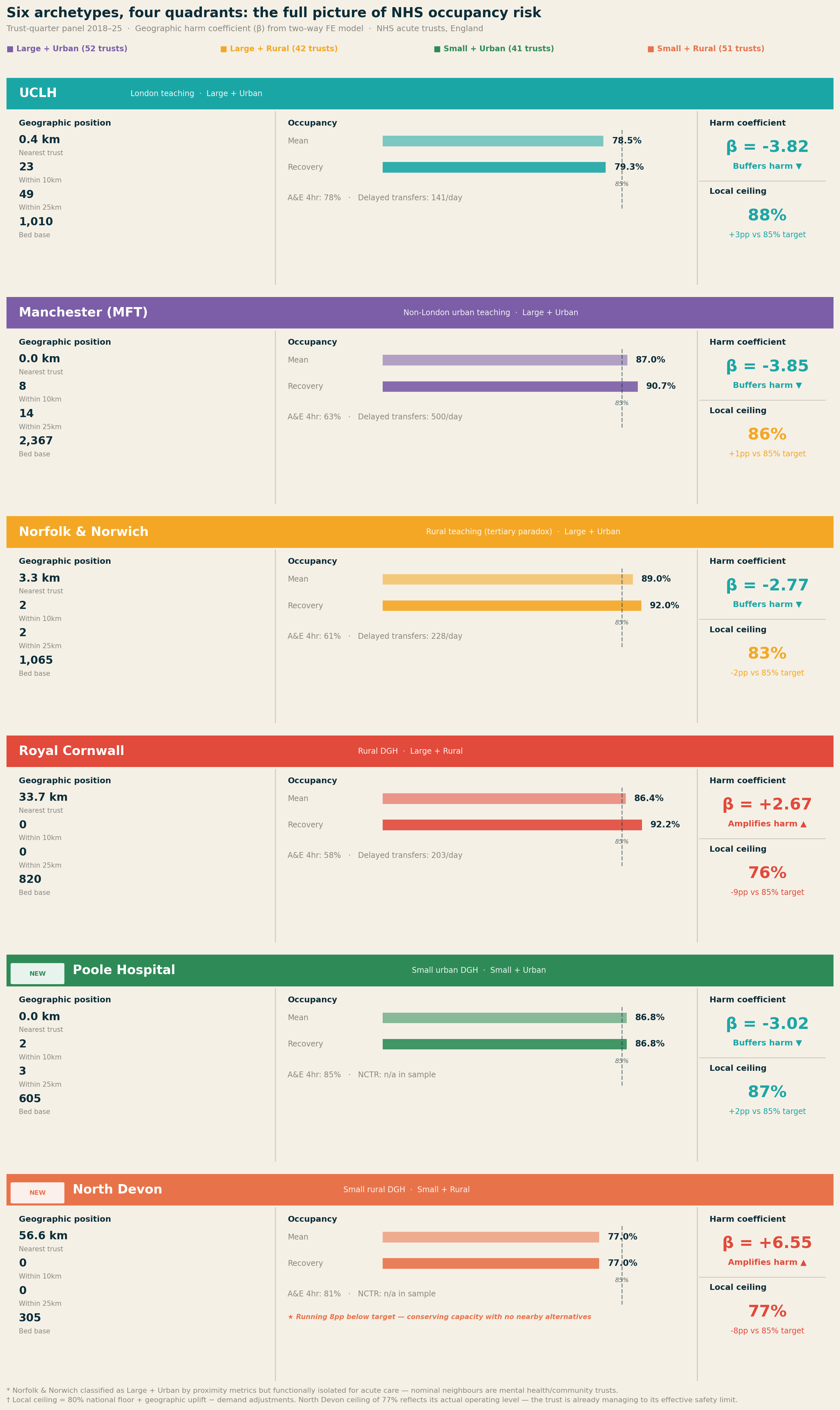
UCLH sits 0.4km from its nearest acute neighbour, with 23 acute trusts within 10km. Its harm coefficient of −3.82 reflects this: rising occupancy is substantially decoupled from patient harm by the density of the system around it. A ceiling of 88–90% is defensible on safety grounds.
Royal Cornwall is the archetype that changes the conversation. Nearest acute trust: 33.7km. Trusts within 25km: zero. In the recovery period, it has not dropped below 85% once. The harm coefficient is +4.12 — the only archetype where crossing that threshold meaningfully increases 12-hour waits. Issuing an 85% occupancy target against a trust running at 92% with no acute neighbours within 50km is surveillance without agency.
Norfolk and Norwich runs at 89% mean occupancy but has a negative harm coefficient (−2.77) due to its tertiary referral role — high occupancy partly reflects complex cases being pulled in from across the region, which decouples occupancy from blocked-bed harm. Delayed transfers (mean 228/day) are the binding constraint, not the occupancy rate itself.
Manchester (MFT) is buffered by Greater Manchester's 8 trusts within 10km, producing a harm coefficient of −3.85. But the 25km ring is thin (14 trusts vs 49 for UCLH), meaning when Greater Manchester stresses as a whole, regional slack is limited. Mean NCTR (No Criteria to Reside) of 500 patients/day reflects scale, not poor relative performance.
Small + Urban: Poole Hospital
Poole Hospital (605 beds) completes the picture on the urban side of the matrix. It is the archetype that most confounds the simple occupancy narrative: Poole runs above 85% in 100% of its quarters, with G&A occupancy averaging 91.4% — yet its A&E four-hour performance is 84.8%, the best of all six archetypes. The harm coefficient is −3.02.
The explanation is geographic buffering. Two acute trusts within 10km means that when Poole fills up, the system around it can absorb overflow. A small urban DGH with nearby alternatives can run at high occupancy without the harm conversion that the same occupancy rate would trigger at an isolated trust. Poole is a direct empirical rebuttal of any policy that reads high occupancy as an automatic signal of risk.
The local ceiling calculation returns 87% — 2pp above the national target — reflecting the geographic uplift from the buffering environment. That Poole is already operating at 91% G&A means it is running above even its own local ceiling, which flags a genuine risk if the surrounding system becomes simultaneously stressed. The individual trust ceiling is only valid when neighbours have spare capacity.
Small + Rural: North Devon Healthcare
North Devon Healthcare is the most striking finding in the six-archetype analysis. With 305 beds and no acute alternative within 57km, it carries a harm coefficient of +6.55 — the highest in the entire dataset, nearly double that of Royal Cornwall. Yet it runs at a mean occupancy of just 77%, well below the 85% national target.
This is not an underperforming trust. It is a trust that appears to be consciously self-regulating to its effective safety limit. There are no ambulance diversion options, no nearby trust to absorb overflow, no geographic buffer of any kind. Running at 77% is not a choice driven by low demand — it is a structural necessity dictated by the consequences of running higher in a system where North Devon is the system for its population.
The policy implication is the most important in this analysis. The 85% target applied to North Devon would not be challenging but achievable — it would be actively dangerous. A trust running at 85% with a harm coefficient of +6.55 and no acute neighbours within 57km would be operating in territory where the model predicts severe harm amplification. The local ceiling from the methodology returns 77% — which, strikingly, is exactly where North Devon is already operating. The calculation is not prescribing a target; it is confirming that the trust has already found its limit.
North Devon is also the clearest possible illustration of the difference between a target and a remedy. The right intervention for this trust is not a revised occupancy percentage — it is investment in community alternatives, discharge pathways, and regional capacity that would allow it to safely operate at higher occupancy. Without those, the 85% target is not just irrelevant. It is a hazard.
What better policy looks like
The data support three clear conclusions.
First: targets should be trust-specific, not universal. If the relationship between occupancy and performance is fundamentally mediated by bed base and geography — both measurable and known — then a trust with 200 general and acute beds in a rural setting should not be held to the same target as a trust with 800 beds in a dense urban network.
Second: geographic position should be a primary input to winter planning. The right unit of analysis for winter planning is the local health economy, not the individual trust. For genuinely isolated trusts — Royal Cornwall, Isle of Wight, parts of the rural Midlands — the relevant intervention when they breach their local ceiling is system-level, not trust-level.
Third: for isolated trusts, the right intervention depends on the specific failure mode. For large isolated trusts like Royal Cornwall, where high occupancy reflects genuine demand-capacity mismatch, delayed transfers (NCTR) are the binding constraint and the right target — NCTR is the lever, occupancy is the symptom. For small isolated trusts like North Devon, where the trust is already self-regulating near its safety ceiling, the right intervention is not a target at all. It is investment in community alternatives, step-down capacity, and regional transport infrastructure that would allow the trust to safely absorb higher demand. Issuing a tighter occupancy target to a 305-bed trust with no neighbours within 57km is not health policy. It is the appearance of oversight in the absence of a remedy.
Conclusion
The NHS has managed bed capacity against an 85% target for 25 years. The target was derived from a 1999 queuing model of a single static 200-bed emergency ward. The NHS discarded the size-dependence built into that model and applied the resulting number universally. The target has since drifted to 90% and then 92%, without new evidence, while the system has consistently operated above all three.
Analysis of approximately 5,400 trust-quarters finds no statistically significant threshold effect at 85%, or at any level from 80% to 92%. The target is not a detectable feature of the data.
What the data does show is that occupancy risk is a function of bed base size and geographic position. Across six archetypes spanning all four quadrants of a size-rurality matrix — from UCLH with 49 acute neighbours within 25km to North Devon with none within 57km — the range of harm coefficients runs from −3.85 to +6.55. A single threshold applied across that range is not a safety standard. It is a fiction.
The 85% target did not cause the NHS's winter pressures. But it has consistently misdirected the response — focusing accountability on individual trust occupancy rates when the real mechanisms are local health economy design, community discharge infrastructure, and the geographic distribution of acute capacity. The data to do better already exists. The methodology to translate it into trust-specific guidance has been built and published. What it requires is a willingness to retire a number that survived for two decades not because it worked, but because it was the only number anyone had.
A flexible approach to the issue
The methodology for translating the national threshold into a trust-specific ceiling is fully documented and reproducible. The calculation requires three inputs routinely available to every NHS trust and ICB: proximity data (from ODS postcode records), quarterly occupancy history (KH03), and emergency dependency profile (from SUS).
A command-line tool implementing the full methodology is published alongside this analysis on GitHub at www.github.com/LB1983/nhs-bed-occupancy-analysis An interactive web version is available at https://lb1983.github.io/nhs-bed-occupancy-analysis/occupancy_calculator.html
Data and methodology
Data sources: KH03 bed availability and occupancy (NHS England); A&E Attendances and Emergency Admissions SitRep; Urgent and Emergency Care daily SitRep; Cancelled Operations quarterly return; ERIC NHS estates and facilities return. Trust geographic proximity features computed from ODS postcode data.
Sample: ~140 NHS acute trusts, England. Trust-quarterly returns, 2018-19 Q1 to 2024-25 Q4 (~5,400 trust-quarters). COVID period included in full-sample models; primary analysis uses pre-COVID and post-2021 quarters to avoid structural break.
Specification: Two-way fixed effects (trust entity FE + time period FE). Standard errors clustered by trust. Threshold models: outcome ~ I(occ ≥ t) + FE. Spline models: piecewise linear, knots at 80%, 85%, 90%. Interaction models: outcome ~ occ_z + cap_z + occ_z×cap_z + occ_z×geo_variables + FE. Within-between decomposition via Mundlak-Chamberlain device.
IV attempt: Estate backlog maintenance intensity and pre-1985 floor area proportion (NHS ERIC data) tested as instruments for occupancy. First-stage F-statistics below 10; IV results not reported as primary. Estimates described throughout as well-identified associations, not causal effects.
References
[1] Bagust A, Place M, Pocock JV. Dynamics of bed use in accommodating emergency admissions: stochastic simulation model. BMJ. 1999;319(7203):155–158.
[2] National Audit Office. Inpatient Admissions and Bed Management in NHS Acute Hospitals. London: NAO; 2000.
[3] National Institute for Health and Care Excellence. Emergency and Acute Medical Care in Over 16s: Service Delivery and Organisation (NG94). London: NICE; 2018.
[4] Nuffield Trust. Hospital Bed Occupancy. London: Nuffield Trust; 2025.
[5] Fordham R. Addressing the Knowledge Deficit in Hospital Bed Planning. PLoS ONE. 2024.
[6] Castelli A et al. The association between bed occupancy rates and hospital quality in the English NHS. European Journal of Health Economics. 2022;23:1365–1381.
Now for recent events

Now onto the three biggest health data stories of the moment.
UK Biobank and it's incontinent approach to data security, the Palantir contract and the increasing pressure to exercise the break clause and NHSE shutting up shop on open source code.
Firstly UK biobank. There had been rumblings for some time about their github publishing approach and how that left the data vulnerable. These had been batted back by the leadership of the Biobank as nonsense.
This was issued by CEO Professor Sir Rory Collins directly in response to The Guardian's investigation published the same day (14 March 2026), which had reported on the pattern of researchers accidentally uploading Biobank data to GitHub and other public repositories, and had demonstrated that a participant could be re-identified from just two pieces of information.
Collins wrote that he wanted to reassure participants that their personal information in UK Biobank was safe, and that after 14 years of making data available for scientific discovery, there was no evidence of any participant being unwillingly identified. He stated there had not been any hack or data breach of UK Biobank. He acknowledged that in a small proportion of cases, scientists had unintentionally put de-identified data alongside research findings on publicly accessible websites, but stressed these data did not contain any personally identifying information. He concluded: "I understand that The Guardian's article may be unsettling, but it does not accurately reflect the reality, and we do not believe there is a cause for any concern."
It was absolutely not nonsense.
Dr Luc Rocher has been absolutely incisive on this - both in terms of the 'we bloody told you so' and also smart on the surveilance of where this data have been popping up (more so then biobank themselves which is frankly, embarrassing). Their website https://biobank.rocher.lc/ covers the takedown notices and the full timeline which also includes such lowlights as data being used for race science and pseudoscientific research. Deep sigh.
Until late 2024, more than 20,000 researchers had been able to request access and download data directly onto university computers or laptops. Rocher noted that data had been shared with colleagues and students who were not authorised, leading to further exposure.
There is also a national security dimension: last year, The Guardian reported that security agency MI5 had raised concerns about Chinese researchers' access to UK Biobank data, but the arrangement was nonetheless approved by the government.
Dr Jess Morley (a colleague of Dr Rocher) who is a pal and a general good egg has also worked with them on some practical tips on what to do now the cat is out of the bag. https://www.bmj.com/content/393/bmj.s660
All of the suggestions are predictably excellent but I would add an amuse bouche of humble pie to all the people who told those who raised the initial concerns to go away.

Next up on the stocks is the recent gathering storm of Palantir and the NHS.
The contract, as most readers know is not new news. The reason that it's come up for debate again is theres a break clause which can be exercised soon, Palantir as an entity are doing some batshit stuff in the US and the Middle East (read - supporting a genocide) and most baffling of all - they are getting into workwear. Most depressing to me is that it's already out of stock (not because I want one - but because there's clearly a market for it) and Mandleson.
I'll unpack all of this in the next newletter as it's a biggie but the new news for me was that 2021 is the baseline year for justification of operational benefits — the precise nadir of NHS theatre performance during Omicron. Any subsequent improvement compared to that trough will look impressive regardless of what caused it. This is the methodological flaw the BMJ identified: the counterfactual is not "what would have happened in a comparable trust without FDP," but simply "what happened before at the same trust during a pandemic disruption."
Other interesting points which I found out when starting to poke at it are that in December 2025, the MoD awarded Palantir a £240 million deal for data analytics supporting strategic and operational decision-making. There was no competitive tender. In March 2026, the Financial Conduct Authority awarded Palantir a three-month contract to investigate its internal intelligence data for tackling financial crime — Palantir employees will install the software on-site at the FCA.
Here's a bunch of links to stuff which made me raise my eyebrows...
Hansard — NHS FDP debate, 16 April 2026 | The Register — break clause | Medact briefing | The Lowdown | Corporate Watch FOI investigation | Science, Innovation and Technology Committee, 8 July 2025 | medConfidential written evidence | Computing — SIT Committee chair response
Finally, a late entrant - NHS England appears to be spooked and is closing the door on it's code base and no longer making it open source.
I find it hard to believe that it's not linked to the Biobank furore - but the pages on open source code were taken down in December 2025 which obviously pre-dates the current Biobank scandal by some way. Perhaps it's not the policy which changed but the timing?
On 29 April 2026, NHS England issued an internal guidance note designated SDLC-8 which was covered by Terence Eden in his blog
The directive reads as follows:
"All source code repositories must be private by default. Repositories may be internal where there is a legitimate need for visibility within the enterprise. Repositories must not be public unless there is an explicit and exceptional need, and public access has been formally approved by the Engineering Board.
Purpose: Public repositories materially increase the risk of unintended disclosure of source code, architectural decisions, configuration detail, and contextual information that may be exploited — particularly given rapid advancements in AI models capable of large-scale code ingestion, inference, and reasoning (e.g. developments such as the Mythos model). This red line establishes a default-closed posture for code while the organisation assesses the impact of these changes and ensures that any public publication of code is a deliberate, reviewed, and justified decision.
For P&P Public repositories we will switch to Private on Monday the 11th May 2026. Teams that have a need for an exemption need to declare this to the Engineering mailbox by COP Wednesday 6th May 2026."
Neither the AI Safety Institute nor NCSC have recommended closing open source repositories in response to AI-assisted security scanning which is the purported reason behind it. An interesting nugget is that all of the web pages relating to open source at NHSE were removed in December 2025 which was covered by Digital Health here.
All of this is going in the same direction of travel - the combination of closing open source repositories, the FDP IP ownership question, and the UK Biobank breach all point to the same structural failure: an NHS that is simultaneously expanding its data ambitions while contracting its transparency and accountability mechanisms.
Gah. Accountability theatre. LOCKING IT UP MAKES CODE GO MOULDY - it needs fresh air and fresh eyes. There's a petition, have a look and sign - https://keepthingsopen.com/
And finally

I'm sending this out on the last day of employment at the artist formerly known as BJSS (now CGI). I still have a few more days of maternity leave left before I start my new gig but I'll be technically free wheeling for a little while.
It's been a fun few years back at BJSS, I've had the opportunity to work on some really big problems with some really smart people but recent(ish) changes mean it's time for me to move on. I'm proud of what was achieved in my time there but I'm excited for a new challenge.
My plan is to keep this bus running even when I'm back at work so I hope you'll stay with me - I've had a suggestion made on the next topic on GP / primary care which I'll be picking up. Thank you!
I'll be back out into the world on 18th May so let me know if you want a brew.